Here is the long awaited review of some of the developments on the launch menu sector. Please take notice that because of the great variety of menus out there, I will make mistakes in their names. They could be called "start menu," "launcher," etc. So please, bear with me through this post. Hopefully putting these menus side by side will help us make sense of what we use in order to launch applications on our operating systems.
It is important to understand these menus and the changes they have suffered over time. probably you will find valuable information that will aid us in making a better launcher application for openSUSE.
First of all, let's analyze what
Microsoft did to work on this area.
Starting with
Windows 95, where we find the first incarnation of the Start Menu.
Here the menu is located at Windowsthe bottom left of the window attached to the bottom panel. It contains a label that indicates what version of Windows you are using and also links to programs, documents and settings as well as additional useful activities to work with files. Finally as the very first link ascending is the shut down button. Can you see the difference, for example, with the latest Laucher on Windows 7? how the shutdown menu options are all included in the menu whereas Windows 95 only has shut down and would display different options with the shut down dialog instead.
Then along came
Windows 98 with the more advanced incarnation of the Start Menu.
In this case, the Start Menu added a couple more links to the menu, which graphically remained the same. They added a "Log Off" link as well as a "Windows Update" link. If you notice also, the menu holding the Start Menu added extra links to applications such as Internet Explorer, Email, and also to quickly access the Desktop. To be honest with you, I hardly ever use the desktop button. It just does not do something useful to me. Because, what's something that you need to see on the desktop that you can't find on the Start menu? Very little. It could be useful if you want to quickly clear your desktop from windows that you don't want others or yourself to see.
Windows ME kept the same ideals as 98.
...and later came
Windows 2000
they kept the same ideas from 95 to 2000. I guess their Start Menu invention was just too good to throw away. But then came
Windows XP. It seemed at this time that Microsoft wanted to make things brand new. They had a revolution of their own and reshaped the menu that many use today. They have just tweaked a few things here and there but the ideas set on Windows XP are still present in Windows 7, for example.
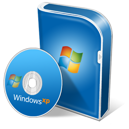
If you notice, Windows wanted to make the menu prettier. In fact, the whole interface in XP was so... blue. (sorry, I can't get passed the strong blues all over the place). In the Start Menu they included a few innovations. They included a picture and a name of the user currently running the session of XP. The menu also got wider. They split the menu in two as well, one are for favorites and most used applications (they were added either manually or by tracking user habits) which by default included only Microsoft applications on it. At the bottom they enclosed the programs menu that expanded as you highlighted it. The right side of the menu contained three main areas of navigation, places, settings and help. and the bottom of the menu had the usual shutdown and log off buttons. This time Windows worked on size. They used bigger and more intuitive visual clues to find and work with the menu. The smallest icons found in it belonged in the category of programs, where they could have all the applications they wanted. The start button itself changed and turned green, with a bigger name on it, START.
Then came
Windows Vista with its revamped menu. It had been too man years and the market pressure made Windows come up with something new rather fast. The menu changed again and new features were added. Can you notice how the menu "grows" over time but it does not "shrink" in options?
This time, Windows played on the side of its name. Windows contain glass and glass is what we got with Windows Vista. The whole interface was a mixture of dark tones and glassy effect. Translucency was the norm in the design and the Start Menu was not the difference. One could almost argue that Microsoft liked this "transparent" design because it would let you have an awareness of what you are doing on the background, thus minimizing the imponent presence of the menu on the desktop. They seemed to have tried to blend the menu into the desktop through the application of transparencies.
This time the Start button disappeared, instead they brought a circle with the Windows logo on it and some nice hover effects. People already understood what that bottom left corner was for and no one seems to have disagreed with this design decision. The also added a search bar to the menu. They must have figured out that people install lots of applications and navigating through them with expanding sub-menus can be difficult. The dual areas remained much like in XP and they also included a very tightly packed Shutdown Button. This time though, people did not like how you had to "discover" where the shutdown button actually was as well as the other options like suspend and hibernate. This time also, they changed the visual presence of the "Favorites" section and minimized the impact of the other "help" areas on the right of the menu.
They also condensed the Programs menu and kept it within the boundaries of the Vista Start menu. No more expanding sub-menus coming out from the Start Button and filling the entire screen.
Finally, we arrive at the latest creation from Microsoft,
Windows 7. The menu seems to retain much of what was introduced in Vista.
This time, the menu added again some features. They turned the programs menu into a tree menu. They also added a secondary button (black arrow) on the Favorites section that once hovered, gives you a list on the right side of the menu, of possible actions you can do given a specific favorite application. Everything else is pretty much the same. But they also changed the panel. It turned into a very visually attractive bar with big icons that can be pinned to it. A dock of sorts.
In conclusion, as the creators of the Start Menu, I have to give it to Microsoft. They simply created something extremely useful and good for everyday use. They have kept their original ideas and have added visual effects and other good inventions to the menu. Much of what we have today in the world of alternative operating systems using graphical environments, comes from Microsoft.
What about the world of
MAC. They are another great company with an awesome approach to computer gui design and it's worthwhile to see what they created when launching applications.
Starting with
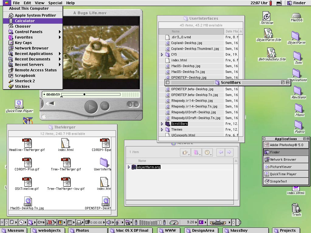
MAC OS
Here the applications menu idea was moved to the top along with the panel. I think this was a very smart approach to computing. If you think about it, the panel at the top along with the applications menu coming down from it work around the areas that the mouse pointer is usually at. Users do not have to drag the pointer from top to bottom (like on Windows) in order to reach that menu (although there are shortcuts, like the Window key) In this incarnation, the menu did not include any icons, just a very simple and basic menu with child menus coming down from left to right.
Later came
MAC OS 9 with some new interesting features...
Here is something interesting. While MAC OS kept the top left applications menu, they added a few interesting features such as the control extensible bar at the bottom (or wherever you wanted it) to work with more technical features of the OS. If you notice also, the top panel does not house the active windows placed on the desktop, rather they are placed as a button (without a "host panel" to manage its presence on the desktop) at the bottom of the screen, if they are folders, and as a small applications menu window if they are running applications.
Next up, we have
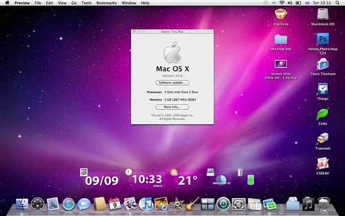
MAC OS 10/X with the introduction of what seems to be, the most clear visual clue that you are using mac, the dock.
This time the dock became the center of attention for MACs. It was big, adorned with nice looking icons and a zoom effect that would pop up on hover. Although it was a great invention, it was harshly criticized because, I think, of the minimalist approach and the zoom effect. Go here if you would like to read more about it.
http://www.asktog.com/columns/044top10docksucks.html
Then other version of MAC have not changed the idea that much, they have instead added more features on top of the dock and the applications folder.
Leopard and Snow Leopard
Overall, the ideas coming from MAC OS have always been pretty straightforward, they have aimed at novice customers and the dock was the main bridge to link users faster with their most used applications and places. It was all customizable (the icons) by the user, meaning that virtually anything can be placed on the dock. I like the idea although I do think that it can be improved. For example, the fact that to launch applications is done at the bottom of the screen yet to work within the program you have to go all across to the top panel in order to reach the application's controls (I know this does not hold true for all applications, but I am just generalizing) is a little uncomfortable. But again, they are places easily locatable, top and bottom, that's it.
Then comes LINUX. As being a very diverse area of design and ideas from all over, Linux has generated very interesting design paradigms when it comes to the desktop. I will try to include the most visible ones, I am sure that I will be missing some, but given the size of research, I would rather work with the ones I consider most visible.
Starting with
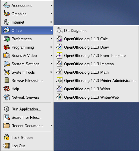
KDE we have a few ideas going around. The main ones though, are based on what Windows has done. I think that the main difference in KDE was just the fact that they grouped applications in categories. The main idea here seems to hide the populated menus from users by using categories.
This menu in KDE 3 is a good example of what they did before the 3 series. This one menu seems to come from Mandriva One. Notice just how similar it looks to the Windows Start Menu (before XP). I think KDE has always had this thing to them, that they can do everything that Windows does, plus more.
Along come other ideas, custom made menus for KDE. For example Tasty Menu:
I actually used this for a little bit. It was big, it contained a lot of programs around. But I did not like that after a while, I had to click too much to get to certain things. I also could not reach certain buttons too fast. I had to drag the mouse over an area of the screen that was too big. Just think of clicking the top corner to bring the menu down and then drag the pointer almost all the way down to the bottom panel to click "Shutdown." So I reverted to Kmenu.
Others have opted for the power of the Plasma desktop to create some launchers such as Lancelot.
Now, what you see here is a good idea of the menu. I like the tabbed interface for your programs. To me though, it looks very similar to what Tasty Menu wanted to do; to show you everything and yet lacking space to do so, so they reverted to proven ideas like sliding menus. Like the one for Programs. The Shutdown buttons are also at the bottom, something that can be worked out. It is overall a good idea, very flexible, very fast and simple. They play also with icons and visually recognizable items. They also include descriptions for items, but if you notice, they don't fit there all the way sometimes. Are they needed?
Gnome, for example has kept the Windows idea for a very long time. They do the same that KDE does with applications' categories.
This one example comes from a Fedora release. But the idea is the same. The Gnome Menu looks just like Kmenu except the spacing between the items. KDE's is thinner.
Then along came
Ubuntu. they turned the Gnome Menu into something more broken apart in hopes of separating the sections' categories so that users find what they want faster. The idea has remained the same for a while, so I will just use one example.
The split the categories from one big menu to three smaller menus (of course, depending on the amount of applications that you have, my current gnome menu for preferences reaches all the way down to the bottom of the screen) and you also have to deal with the default Gnome's item spacing, which only gets reduced by custom styles. (I think this has been a complaint for a while, the lack of novice user style changes).
Other Gnome-based menus that look very much alike are the
Mint Linux menu and the
SUSE Gnome version menu. Take a look:
and SUSE...
The differences are mostly on the way they handle the display of applications. But the two pane system is the same. One side for Favorites and the other with Settings. They also seem to work on the side of simplicity, except their simplicity is big. These two menus take up considerable amount of screen space. I would not work with this on a Netbook.
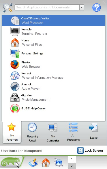
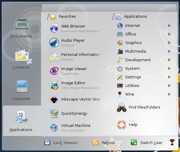
Finally, openSUSE created
Kickoff. I really like this menu. It has a good size, you can search through it fast and find what you need quickly. It contains tabs and the same categories found in other menus. There are also some ideas coming from the XP Start Menu. They only kept the categories contained within the space that kickoff uses. Not expanding menus.
I recall SUSE doings tons of talking about this menu and I believe, the result is a good one. However, I am convinced that we could go even further. To think outside the box to create something amazing. Take, for example, alternative operating systems. I love these ones, because they simply have no pressure to look and be like the rest. They are sometimes so small a platform that they do not want to feel so "mainstream" and "alike."
Take for example these menu from
BeOS (I have to confess, I love this OS)
This one is very simple, all inclusive (places, favorites, and applications) and also a window tracker. It had the ability to dock the opened applications to it as a button. But I was a little taken back sometimes because of the arrow orientation from the menu. The child menus were appearing from right to left and yet the arrows pointing to the name followed the reading orientation, left to right. So my eyes would be expecting a child menu to the right and yet the showed to the left.
And of course, we have menus coming from the
mobile world. Here are some examples:
I just put these three because they are good examples of what smart phones are doing today in order to put content on your fingertips. I like these ones a lot. They are so simple and they seem to be very free. By this I mean that when an application is installed, they are just added to the menu. You know what you just installed and where it will be, so smart phones have done away with categories, so to speak. They just "group" applications that are similar on the same screen. But it is very customizable, and users generally understand how to find them, and they do it fast.
Conclusions
The ideas presented in this list of "menus" is a very long one. I am probably going to set a record to myself with the longest entry so far, but it is necessary. This will be good food for thought. I will work with these and look for strength and weaknesses and talk about them accordingly. These menus represent the work of very talented people and the results have been quite remarkable. In fact, it seems that we just can't get rid of the "start menu" idea. It is still around since Windows 95 and it is here to stay.
PS: I did not include a lot of criticism on this post because I just wanted to gather them and put them on display. The criticism comes next.
Andy


2 comments:
Post a Comment